
xDAI
A sidechain of the Ethereum blockchain known for its stability, fast transaction times and low fees. Now Gnosis Chain.
Led the brand redesign, covering identity, visual language and landing pages. The goal was a flexible, extensible identity that showed the product’s technical sophistication without making it look hard to use — ease and security carried by the same system that carries the innovation.
The work shipped as a brand guide the ecosystem could build on: lock-ups and clearance, a two-primary palette, a type scale, and a geometric illustration kit that composes into covers, icons, apparel and ads. The full guide is below.
Identity
A mark built from two crossing strokes — the x of the name and the exchange it stands for — set in a rounded chip so it holds at avatar size. Three lock-ups cover every surface the chain shows up on.



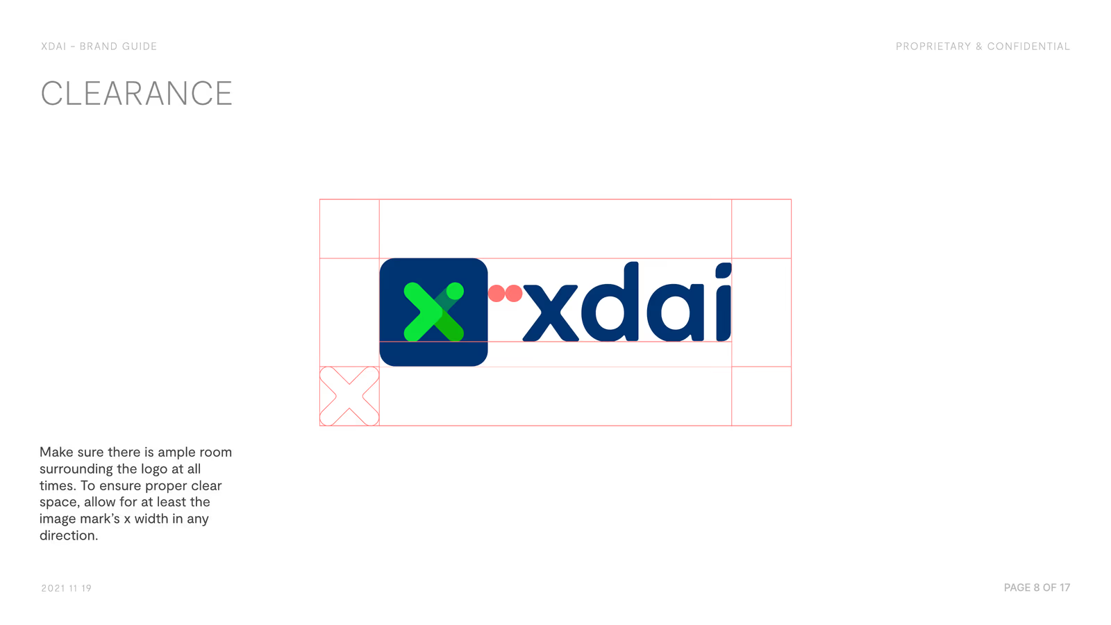
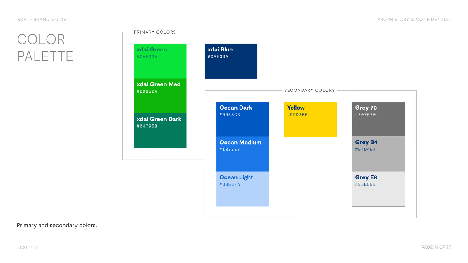
Illustration & Collateral
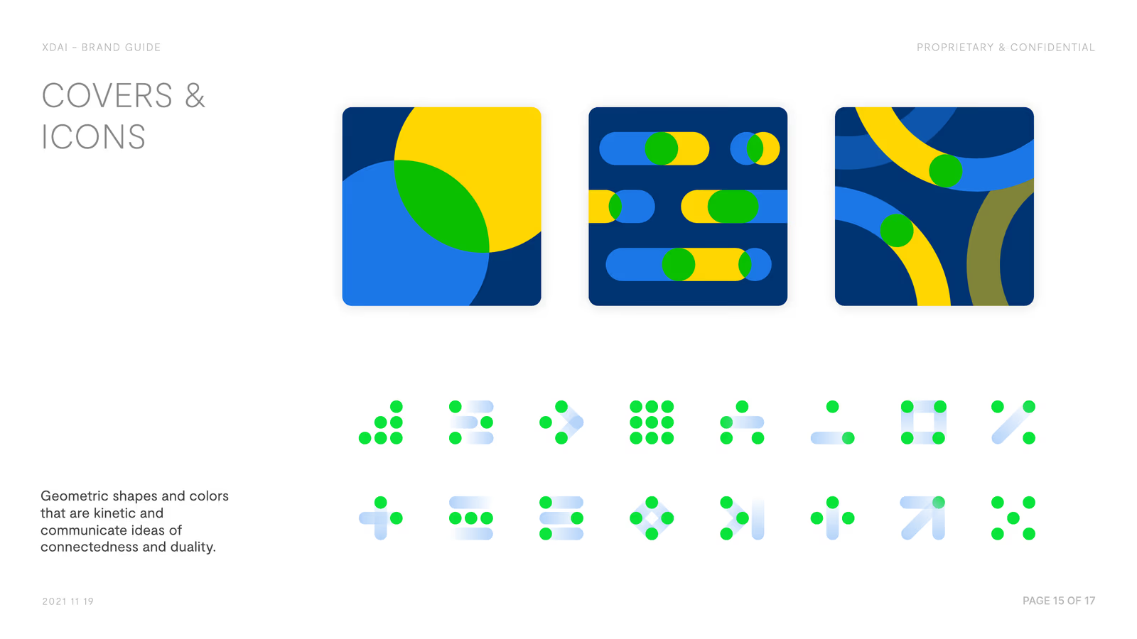
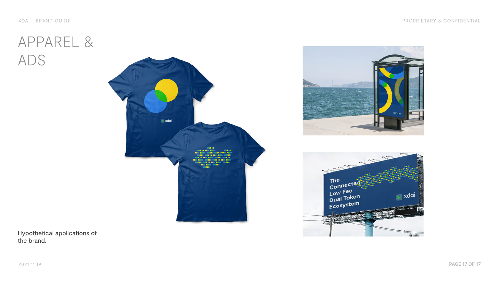
A geometric kit — arcs, dots and rounded bars in the palette — that composes into covers, icons and apparel without ever needing a new drawing.
Brand Guide
The full 17-page guide — identity, colour, typography, illustration and application. Click the page or use the arrows to go through it.
Landing Page
The chain rewritten for the people evaluating it — developers, users and stakers each given their own route in, and the dual-token model explained in place of being footnoted.
