terraFlow develops data analysis software that saves labs and pharmaceutical companies weeks of manual research work. I partnered with the founders to transform their brand and product experience into something worthy of their scientific innovation.
To better communicate their values and inspire confidence, I redefined terraFlow’s identity from the ground up – crafting a brand that fuses scientific rigor with human clarity.
I reimagined their web experience to make their sophisticated value proposition feel accessible, and elevated their product and user experience to make research workflows seamless and intuitive.
The result is a unified brand and platform that accelerates biological insights and positions terraFlow as a trusted leader in biotech digital products.
From the Client

"Sascha's in-depth research process of our scientific domain combined with his exceptional product design expertise transformed our vision into a truly groundbreaking application. He didn't just design a clickable version of our reports but a sophisticated solution that empowers our researchers to unlock new discoveries."
— Arielle Ginsberg, terraFlow CEO
Brand & Product Challenges
Their brand identity, landing page, and MVP product weren't effectively communicating the solution's value or providing a unified user experience.
High-Level Objectives

Create an updated brand identity and collateral that better represents terraFlow's vision, mission, and offering
Redesign the landing page to clearly communicate brand values and product benefits
Expand the analysis features and make recommendations to grow the MVP into a fully functioning SaaS platform and translate those recommendations into a Product Requirements Document.
Design a new web application from the ground up to provide a seamless experience for researchers to explore, compare, and interpret phenotypes
Rebranding & Visual Identity
I developed a new brand identity that positions terraFlow as the scientific standard for cytometry analysis—balancing rigorous precision with accessible simplicity.
The visual system and collateral reflect their mission to democratize complex data analysis while maintaining the credibility essential to pharma and biotech audiences.
Before

After

Collateral & Marketing Design
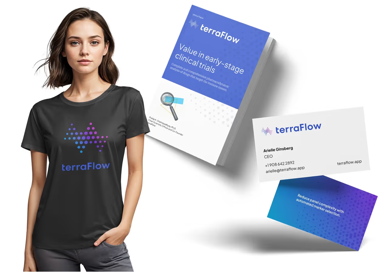
Illustration Style
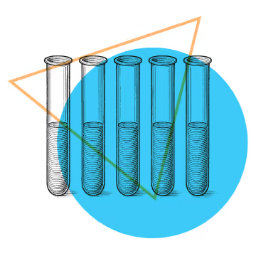


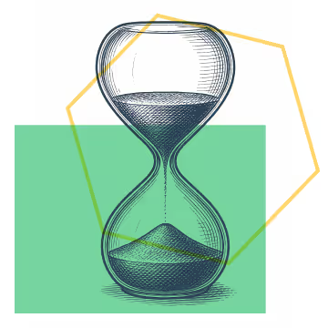
The illustrations blend classic engraving techniques from scientific publications with modern geometric shapes, creating visual depth. The combination of detailed line work and bold shapes evokes layers of information, delivering a contemporary yet authoritative feel ideal for the research-focused brand.
Landing Page
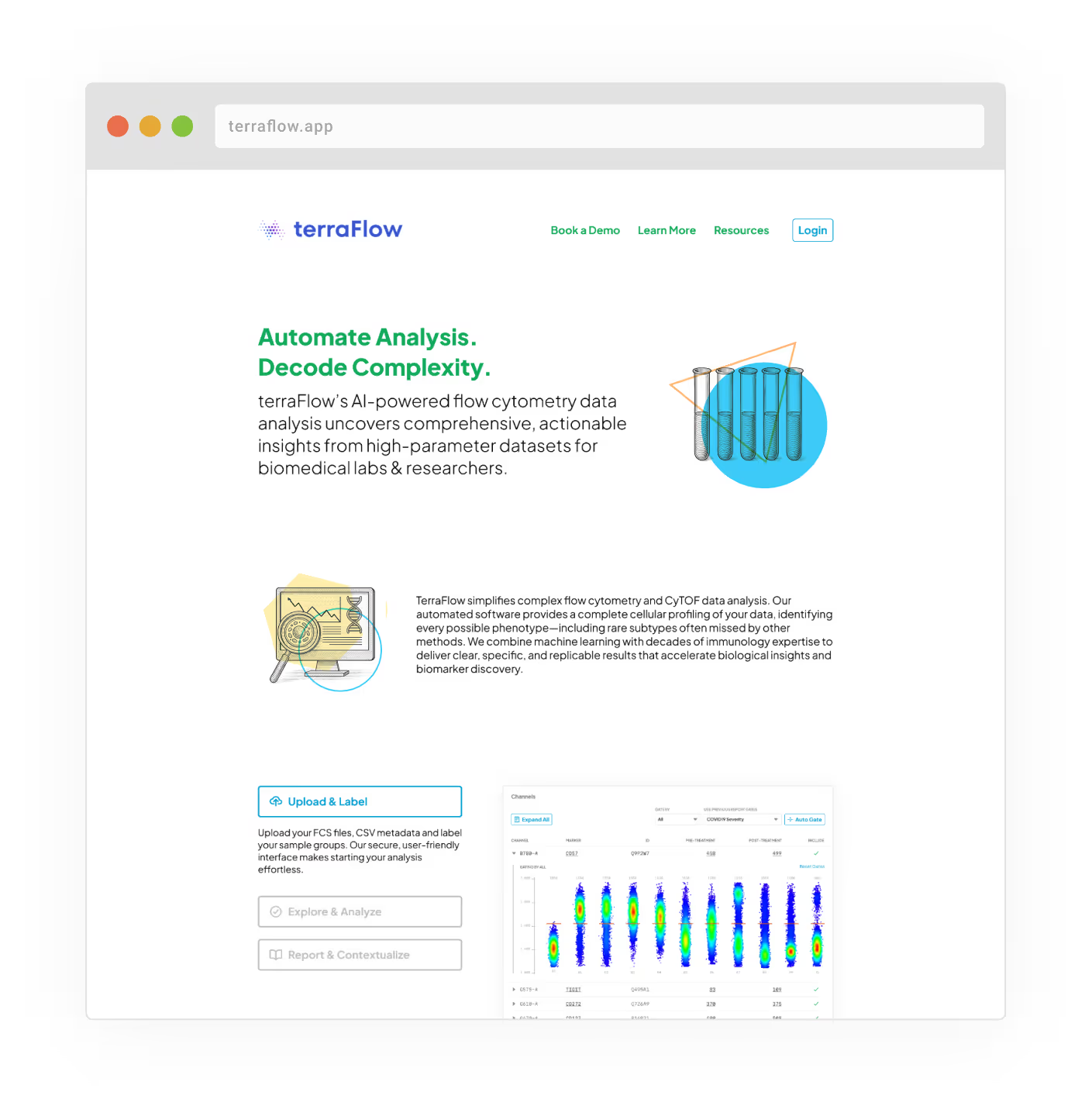
The redesigned landing page clearly communicates terraFlow's unique value proposition. The new landing page speaks directly to time-pressed researchers, transforming technical capabilities into tangible benefits with clear messaging and intuitive information architecture.
Product & UX
Working closely with the founders, I created an improved user flow and restructured the app to make uploading and cross-referencing more efficient.
High-Level Objectives

Extended upload features that allow for bulk labeling of data as well as individual gating of samples
Seamless comparison of phenotypes with deep dives through smart cross-referencing to literature
Interactive elements like collapsible sections for reduced visual clutter and progressive disclosure
A new universal literature search feature that doesn't require any data to be uploaded
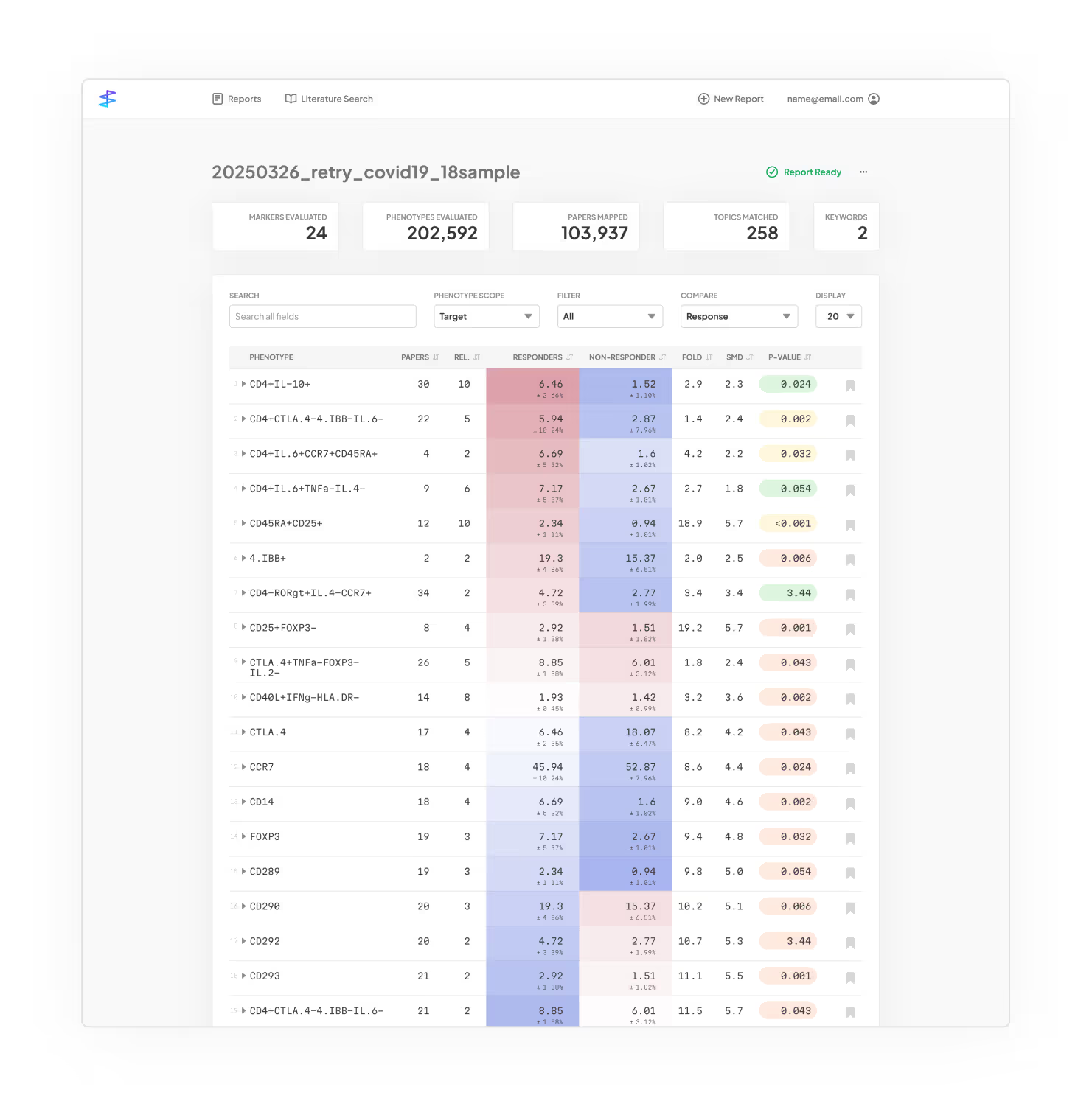
Enhanced Report View: Presents a simple prioritized list of phenotypes while allowing users to drill down into each row and retrieve graphs as well as literature reviews.
A new feature I introduced operates on existing datasets to deliver immediate results and low implementation overhead, broadening the platform’s utility beyond just reports.
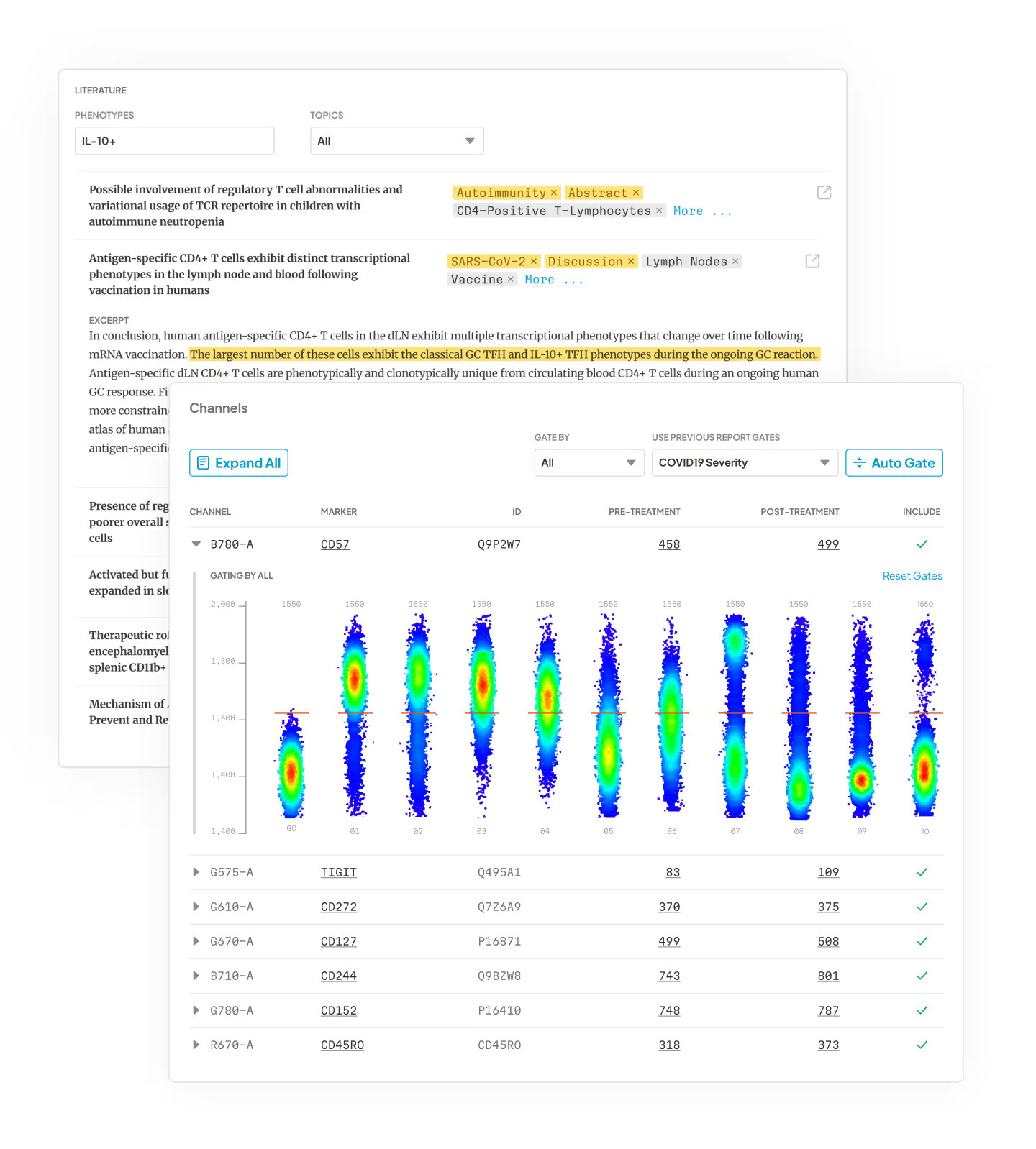
Flexible Gate-Tuning Feature: Applies optimal gates across all samples, allows per-sample adjustments, and lets users reuse previous settings—saving time and improving results.
About my Practice
I've partnered with over 200 companies and innovation projects, bringing extensive expertise in branding, design and product strategy to life sciences and biotech ventures.
I specialize in translating complex information into clear, engaging, and actionable experiences that connect science, technology, and impact.
Schedule a call or get in touch.
Get in Touch

Sascha
Mombartz


More Life Sciences Work
Abiomed Camp
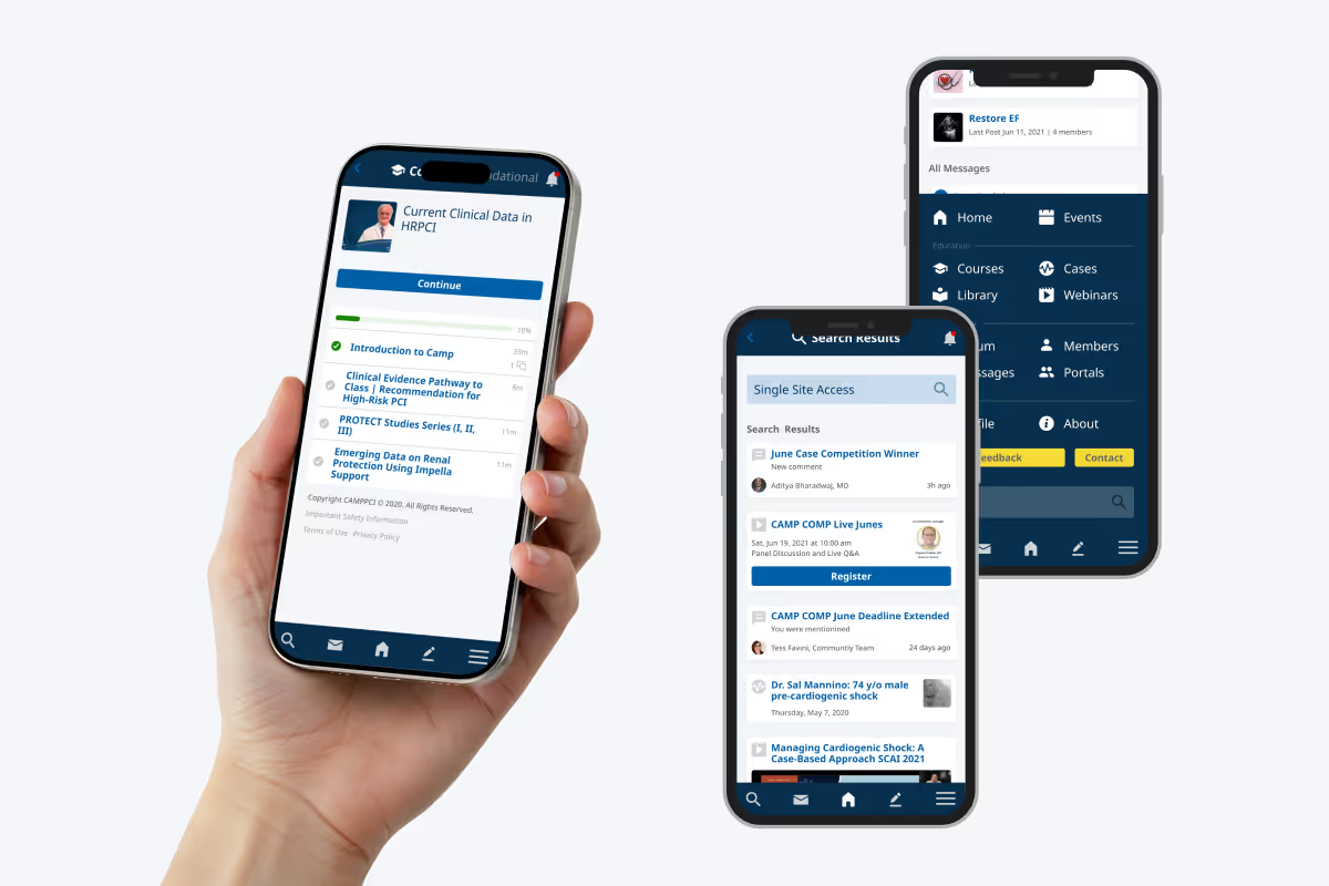
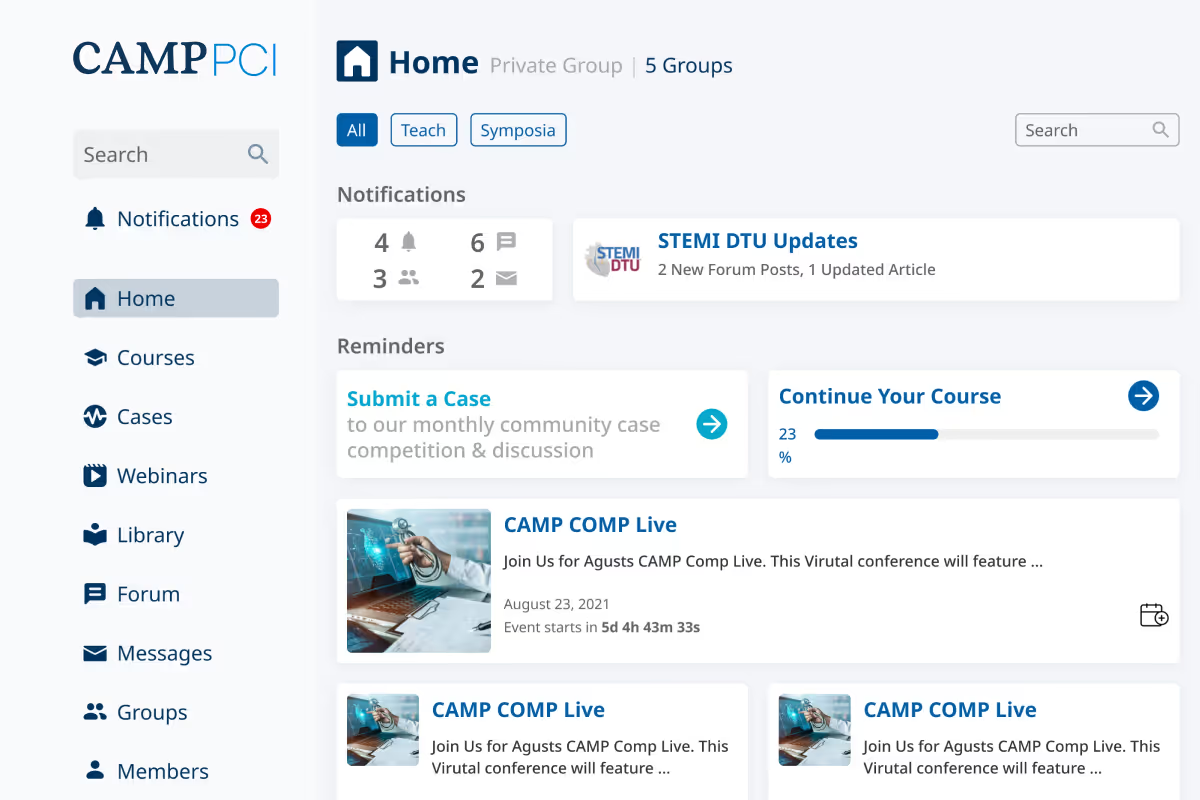
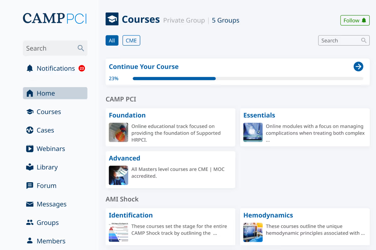
Camp is a community and platform for healthcare professionals, dedicated to responding to the growing crisis in coronary artery disease and heart failure. The custom member portal includes an LMS, webinars, forums, a document library, and member chat, among other features.
Code Ocean
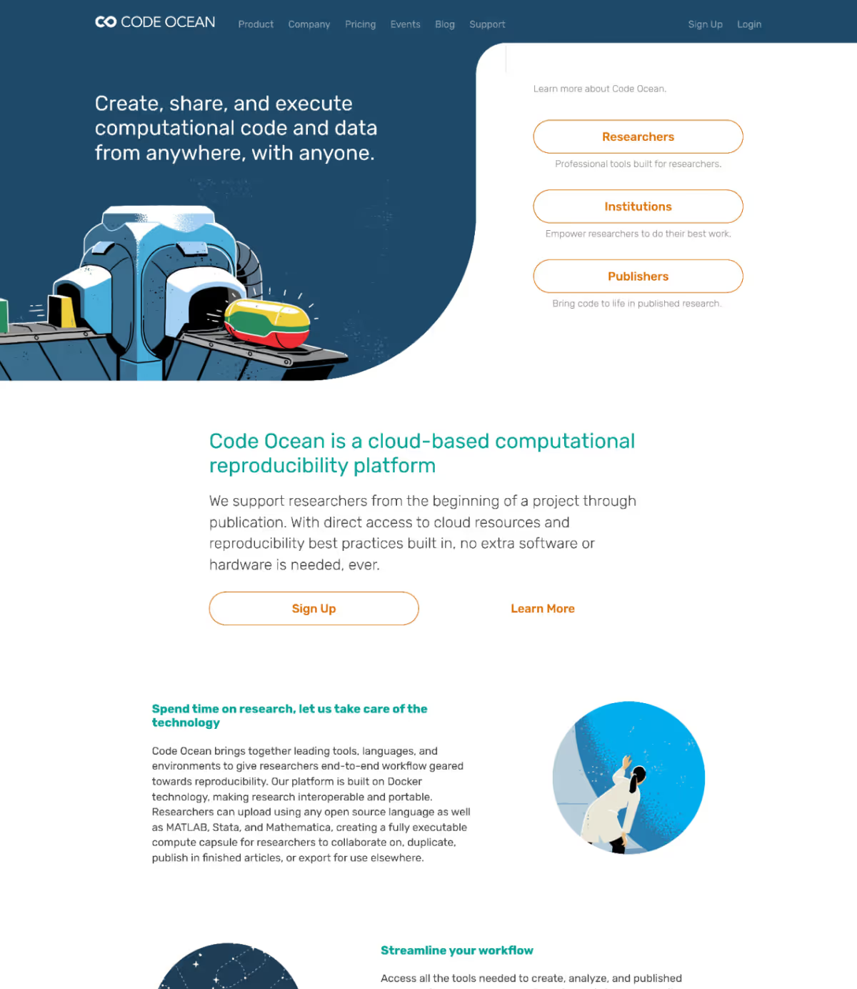
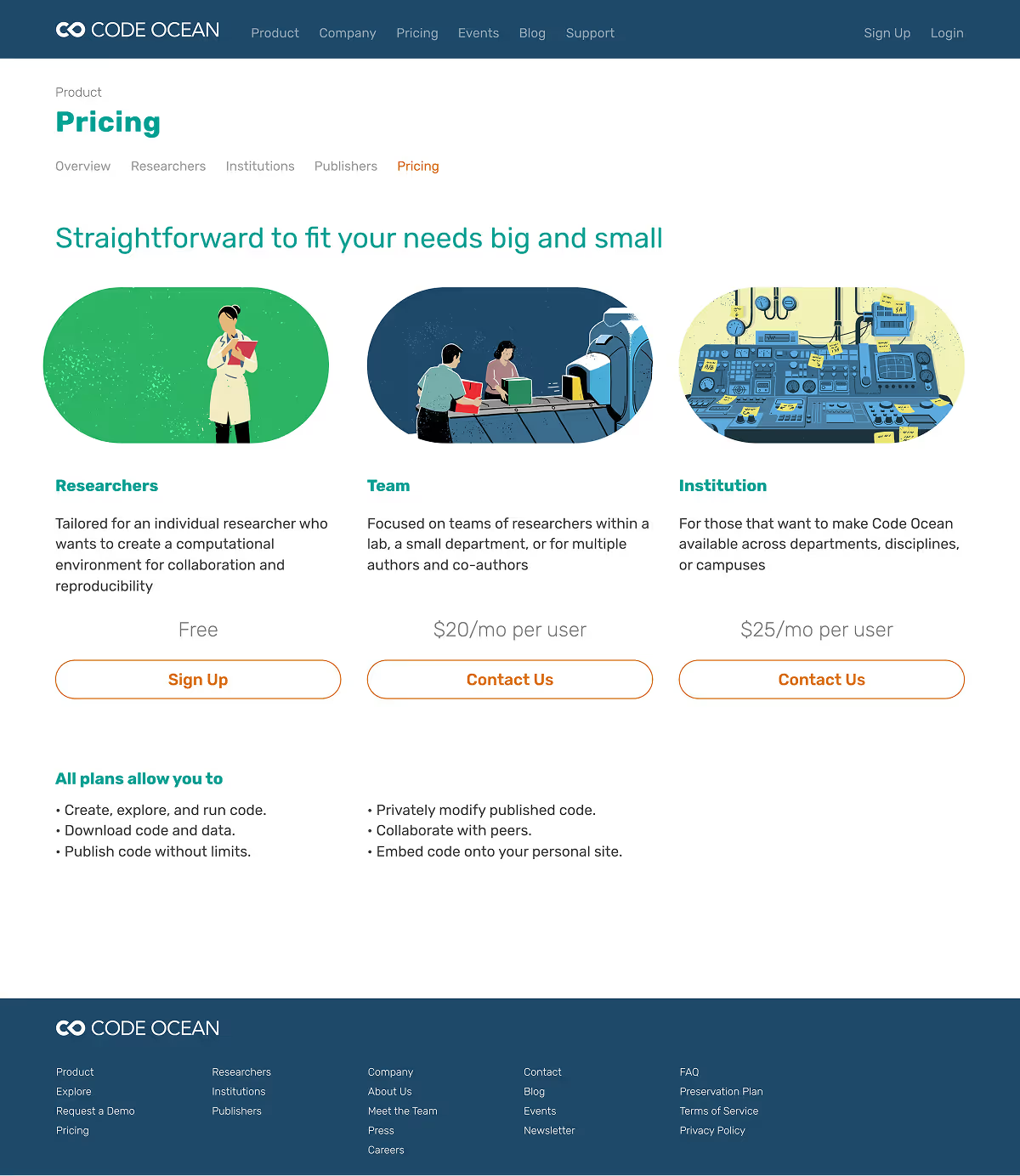
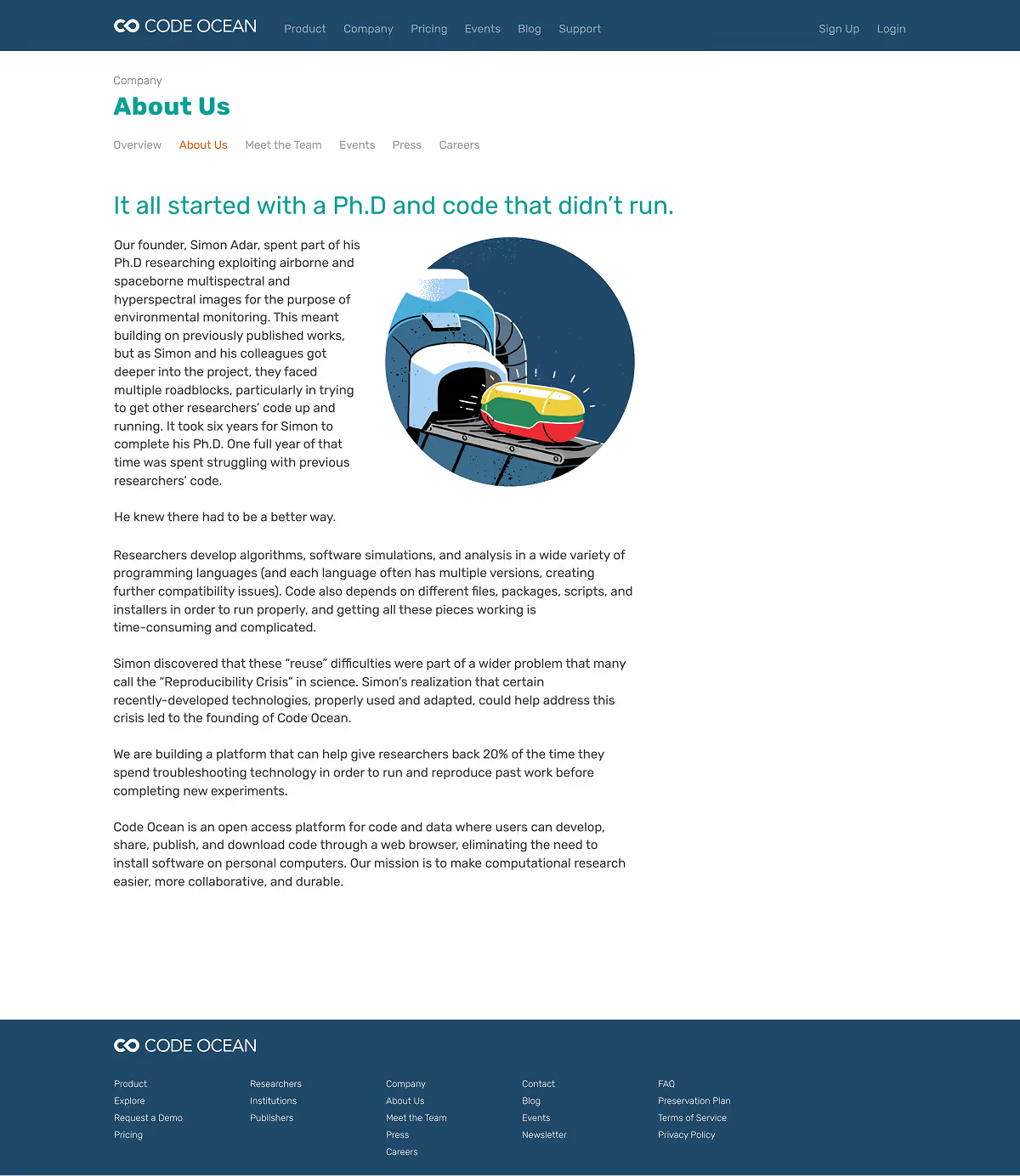
Code Ocean is a research collaboration platform that simplifies workflows with built‑in cloud computing and reproducibility. The redesigned website and custom illustrations reflect its innovative, user‑friendly approach and engage researchers from project initiation to publication.
StartUp Health
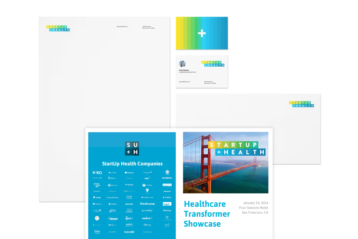
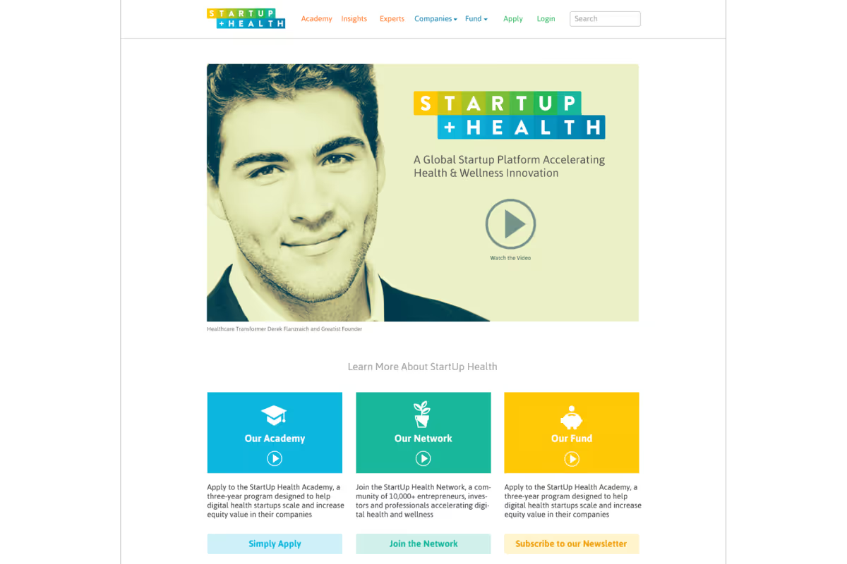
StartUp Health applies a new incubator model to help healthcare startups succeed. The identity system elevates the brand and communicates the company’s vision and values in a charming yet sophisticated way.