Case Study
Pittsburgh Airport Flight Displays
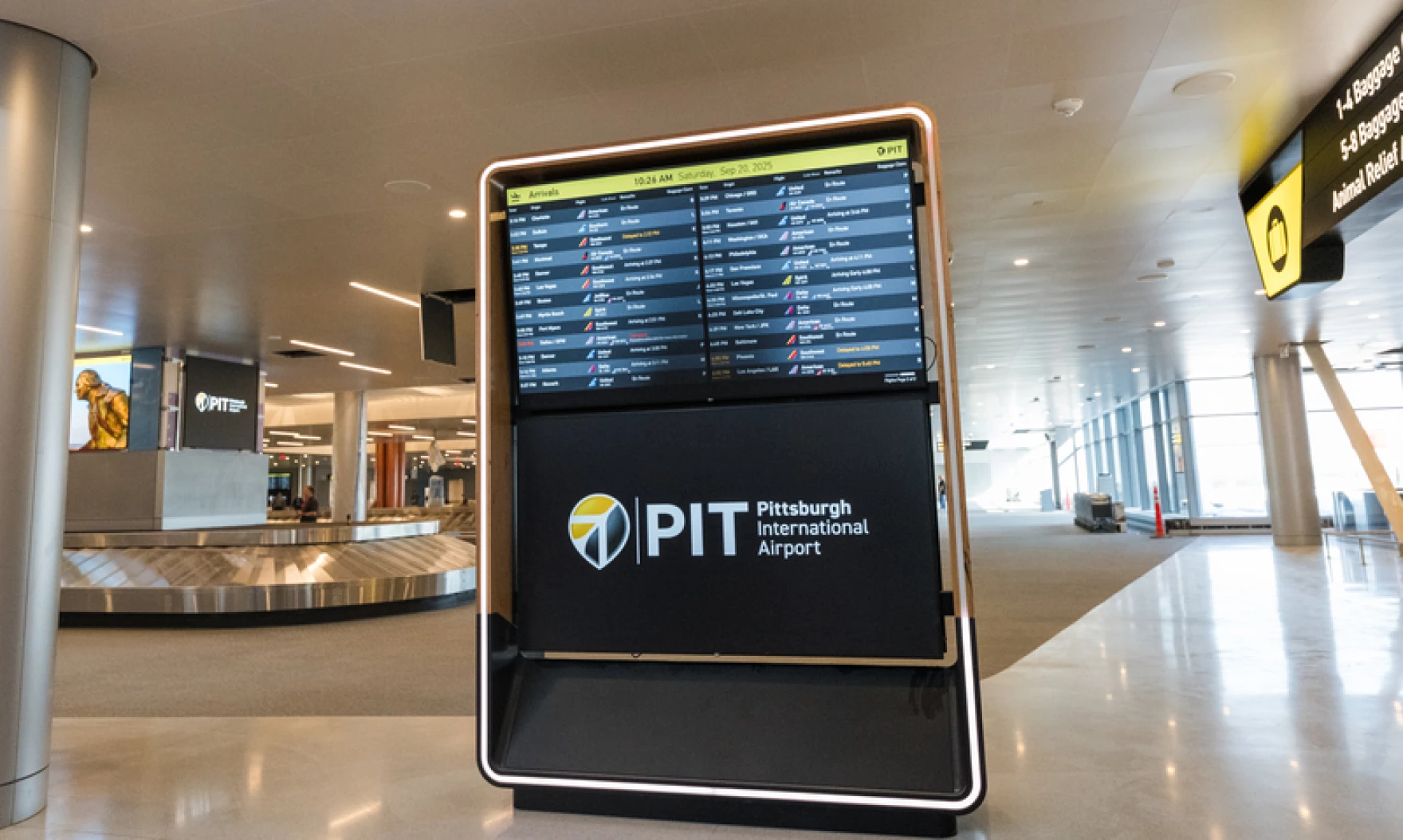
When Pittsburgh International unveiled its $1.7 billion terminal in November 2025, it included a redesigned Flight Information Display System as part of a comprehensive wayfinding overhaul.
As FIDS Product Lead, I guided this project from research through implementation. The core challenge: passengers experience constant uncertainty about gate locations, transit time, and boarding windows. This anxiety compounds an already stressful travel experience. Our goal was to make critical information immediately scannable, giving travelers confidence and calm.
Challenge & Process
Passengers face layered uncertainties—where is my gate, how long to get there, when do I need to be there, has anything changed? Traditional displays answer some of these questions but require mental math and assumptions. This uncertainty drives behavior: people rush to gates after security, then wait for an hour because they don't trust they have time. The experience feels hurried even when there's no rush.
We validated designs through user surveys, live data prototyping, and airside testing. Animated Figma prototypes connected to actual flight APIs let us test with constantly-updating information. Testing in the terminal with real passengers revealed what people noticed, searched for, and found confusing—informing refinements to hierarchy, color, and timing.
Key Design Decisions
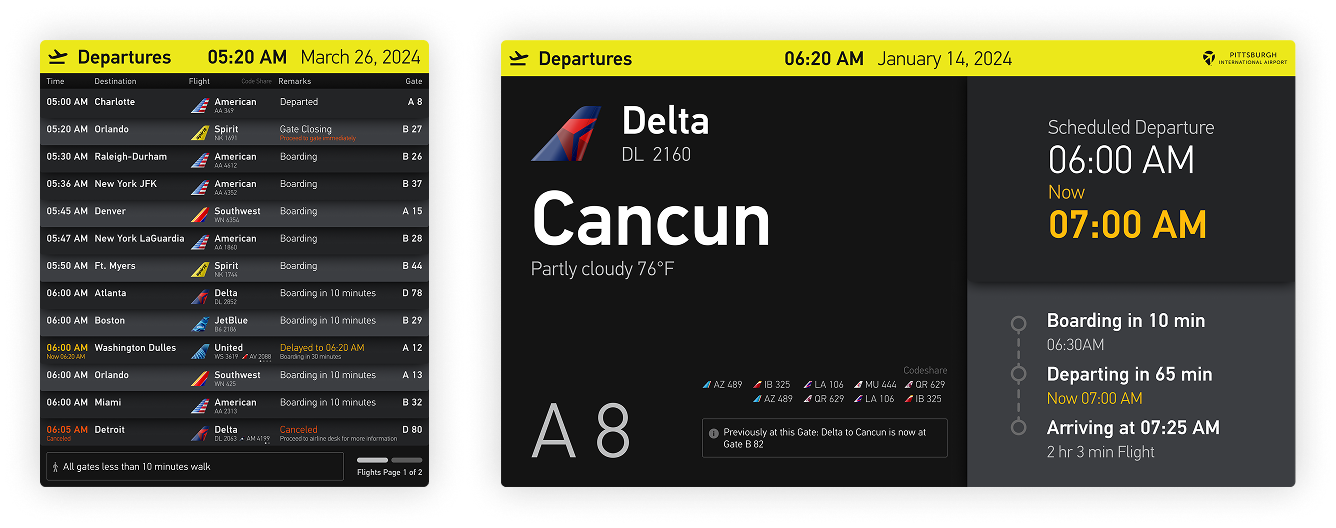
Sorted by Departure Time
Unlike most U.S. airports that sort by destination, we organized flights chronologically. Passengers think in terms of time—scanning by departure is faster and more intuitive.
Tailfin Icons
Airline logos vary wildly in shape and legibility. Stylized tailfins create visual consistency while remaining instantly recognizable, making the board easier to scan.
Time to Boarding
Instead of just departure time, displays show minutes until boarding—the information passengers actually need. "Boarding in 45 minutes" immediately tells you whether you have time for coffee.
Calm Transitions
Smooth animations and predictable paging reduce visual noise. Airports are overstimulating; displays that flash or jump add to the chaos. Gentle motion keeps things calm.
Color-Coded Status
Delays, cancellations, and gate changes use distinct colors visible at a glance. Passengers can assess their situation from across the terminal.
Card-Based Layout
Each flight appears on its own visual card—a nod to the mechanical flip-boards of old. This creates clear separation between rows and makes individual flights easier to track while not adding visual clutter.
About my Practice
I've partnered with more than two hundred startups and innovation projects, bringing extensive expertise in branding, design and product strategy to life sciences and biotech ventures.
I specialize in translating complex information into clear, engaging, and actionable experiences that connect science, technology, and impact.
Schedule a call or get in touch.
Get in Touch

Sascha
Mombartz


More Product Work
WayCount


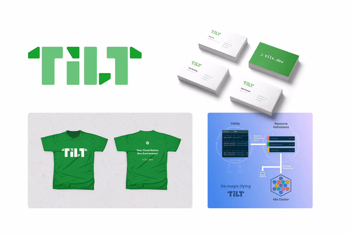
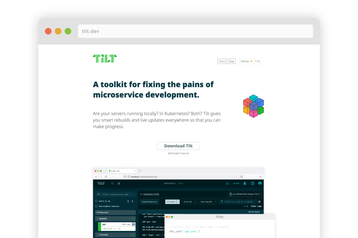
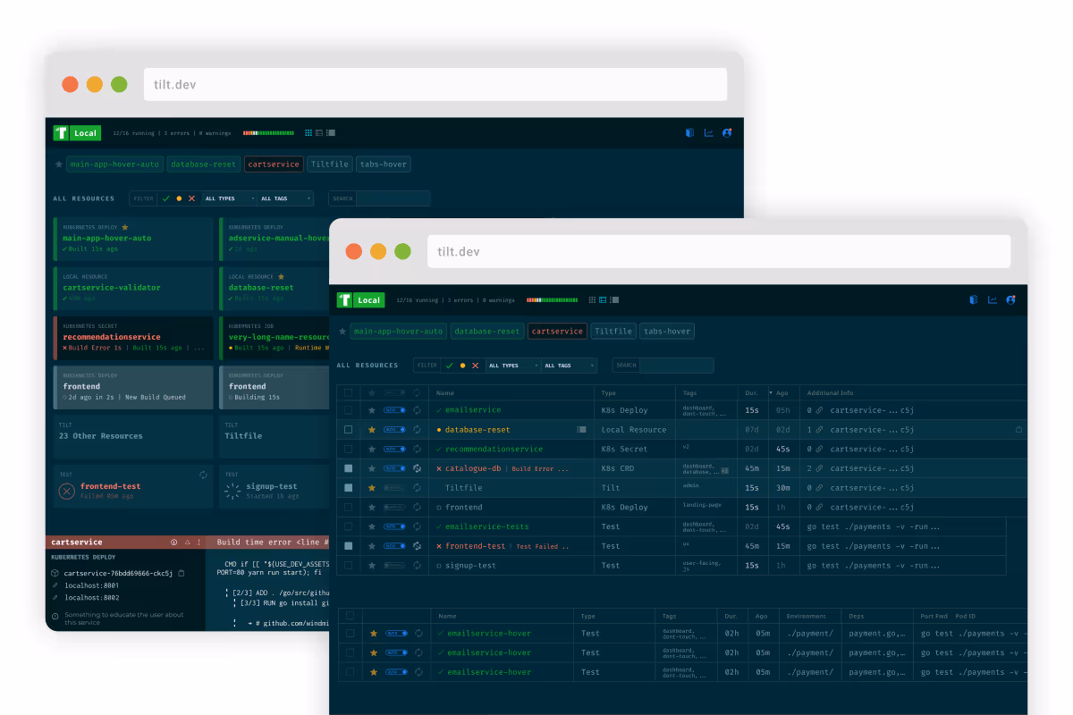
Tilt
Lead the brand redesign and rollout, including collateral, marketing and convention booth design. On the product side I oversaw the content and design of the marketing page, simplified user flows, and established a cohesive visual and UX experience.
Blockscout